Lipstick Queen
Lipstick Queen
Brand Design, Illustration, & Packaging Design
-
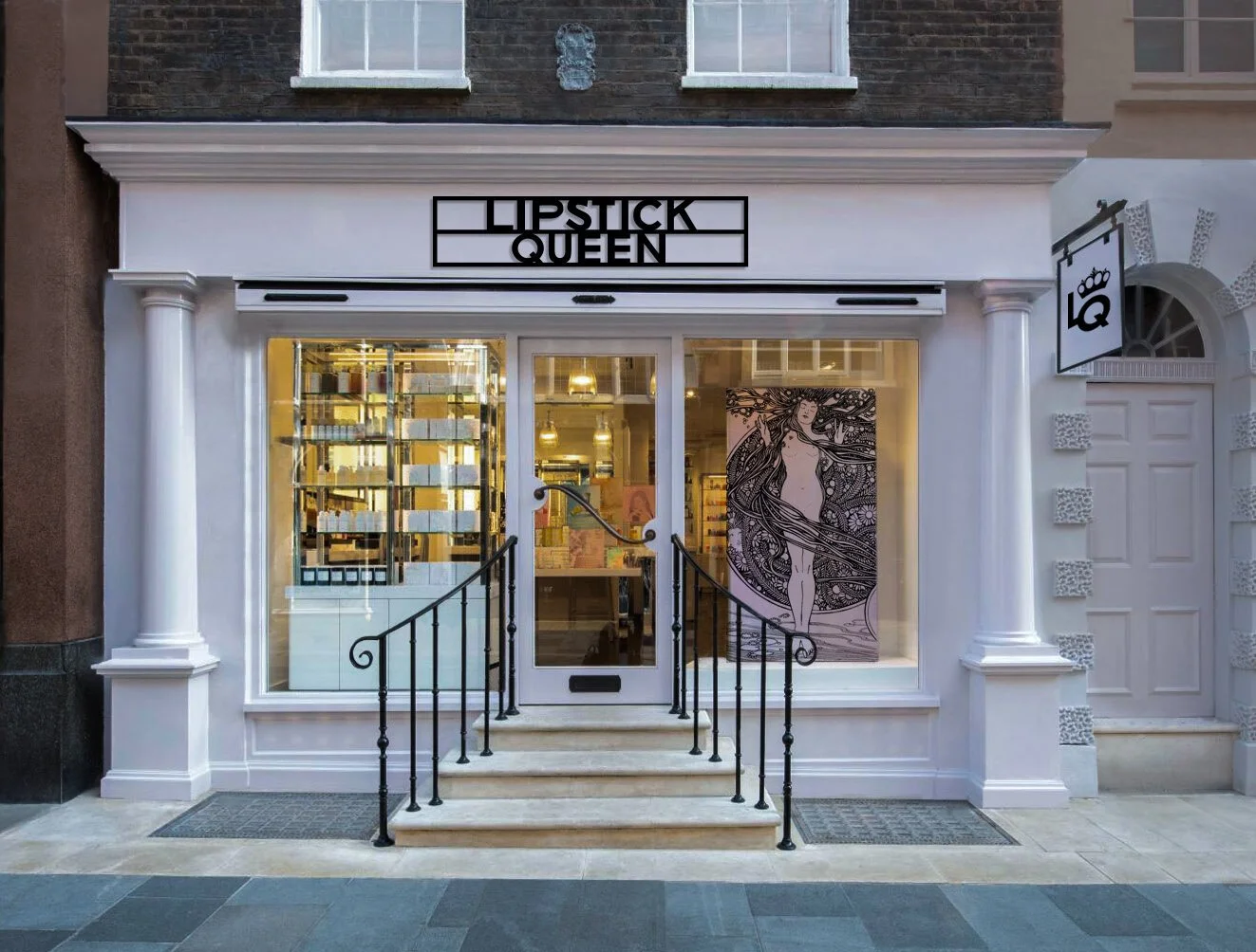
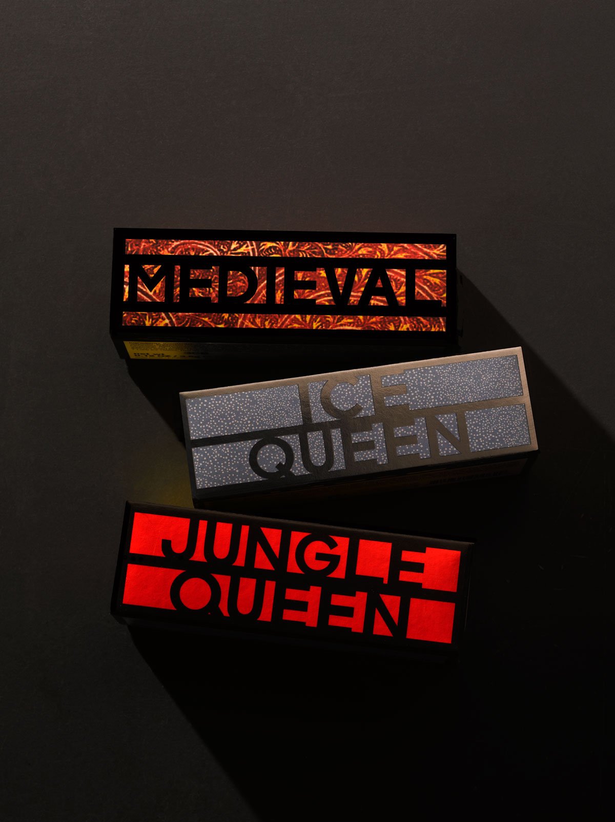
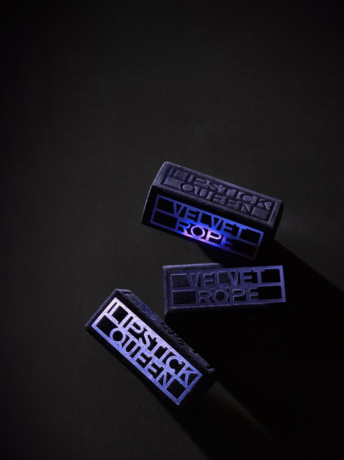
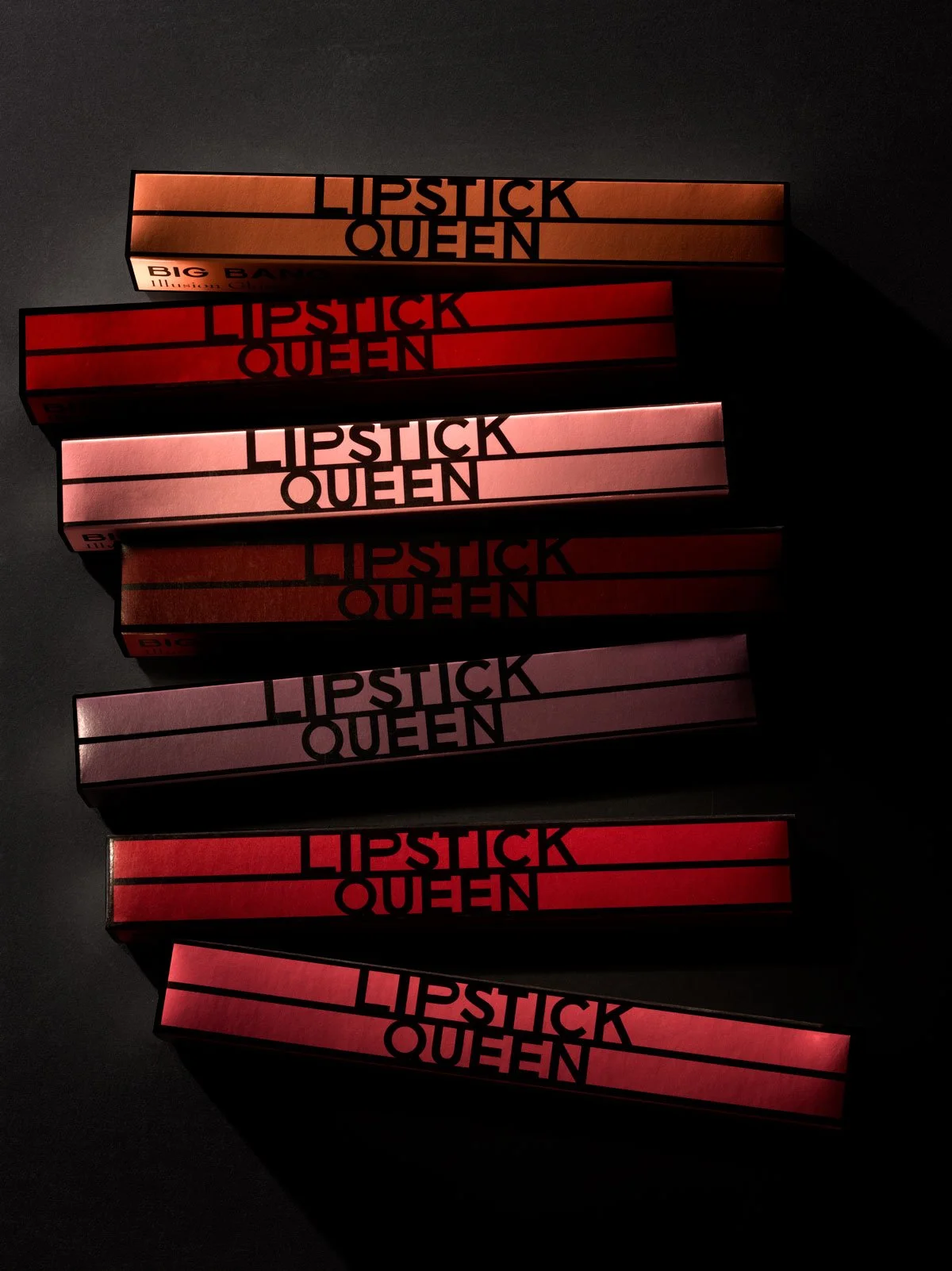
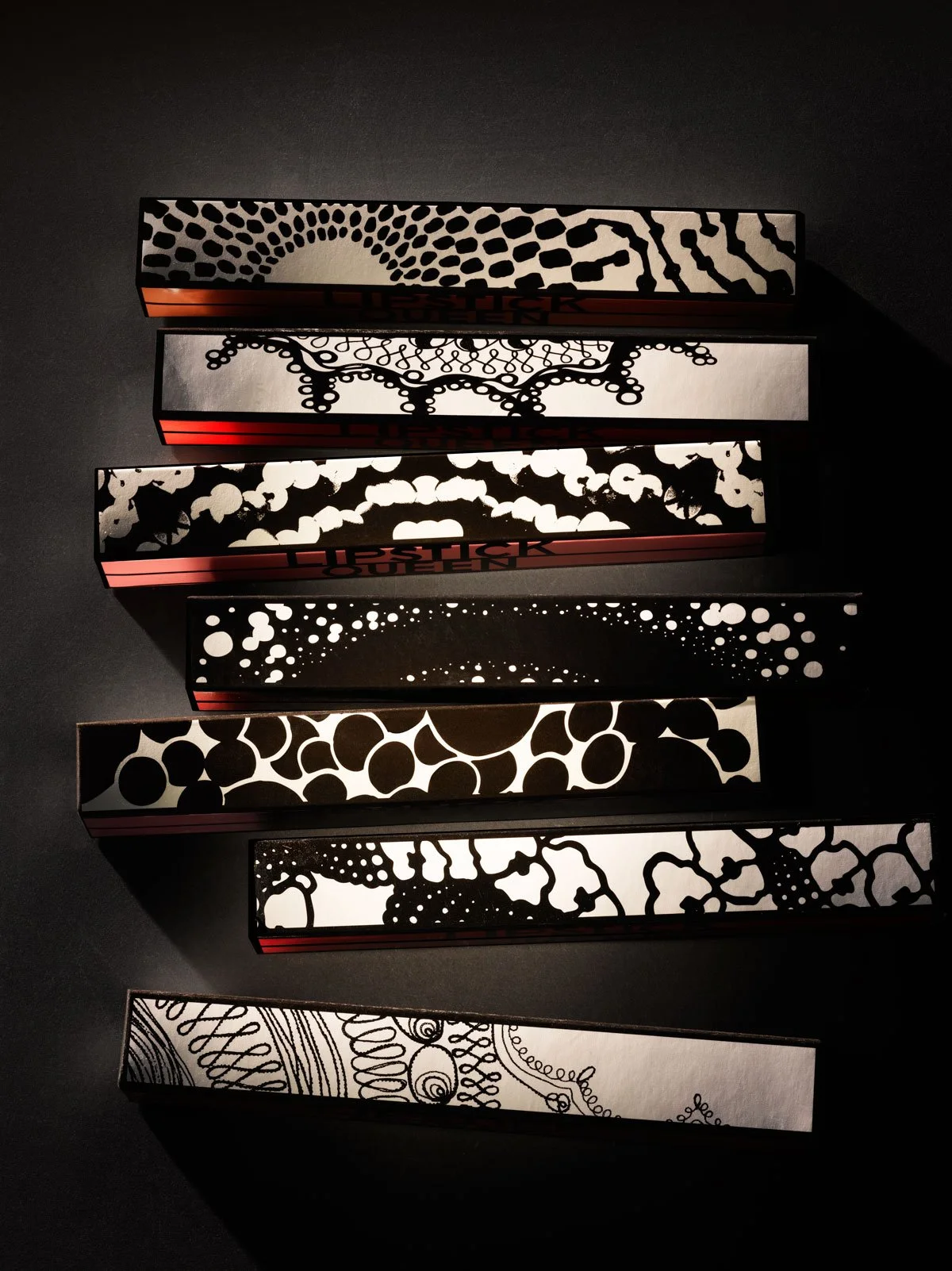
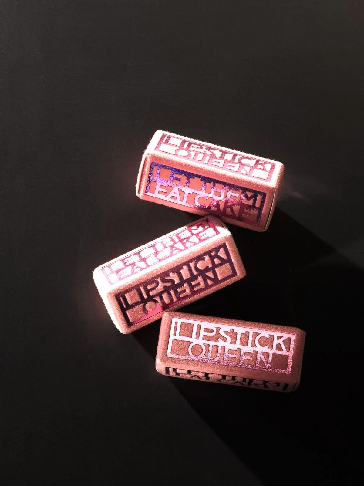
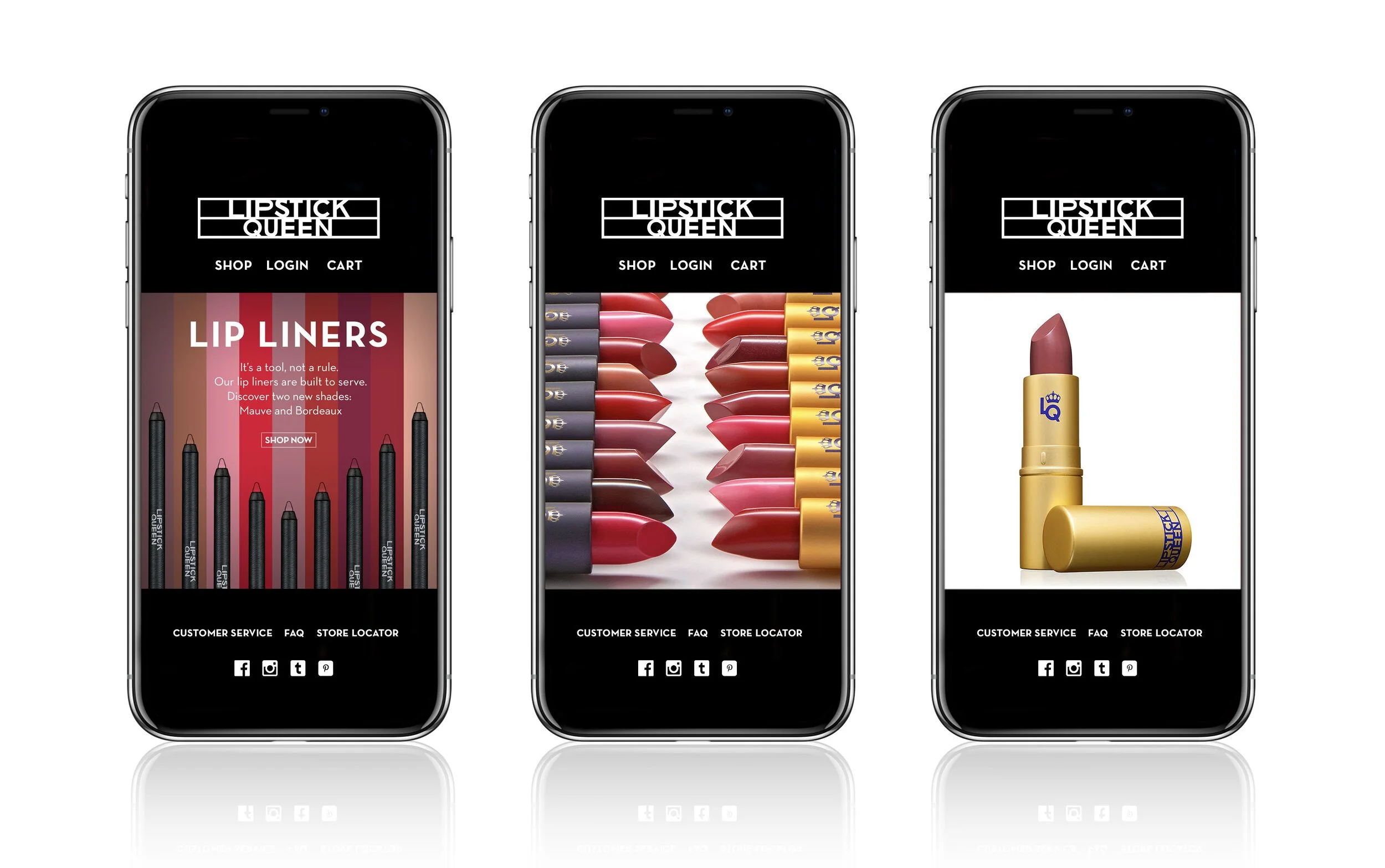
Conceived by beauty entrepreneur Poppy King and creative director James Benard in 2006, LQ carved out a unique space in the beauty industry with blockbuster products conceived by Poppy King, with unconventional branding and packaging from Benard Creative.
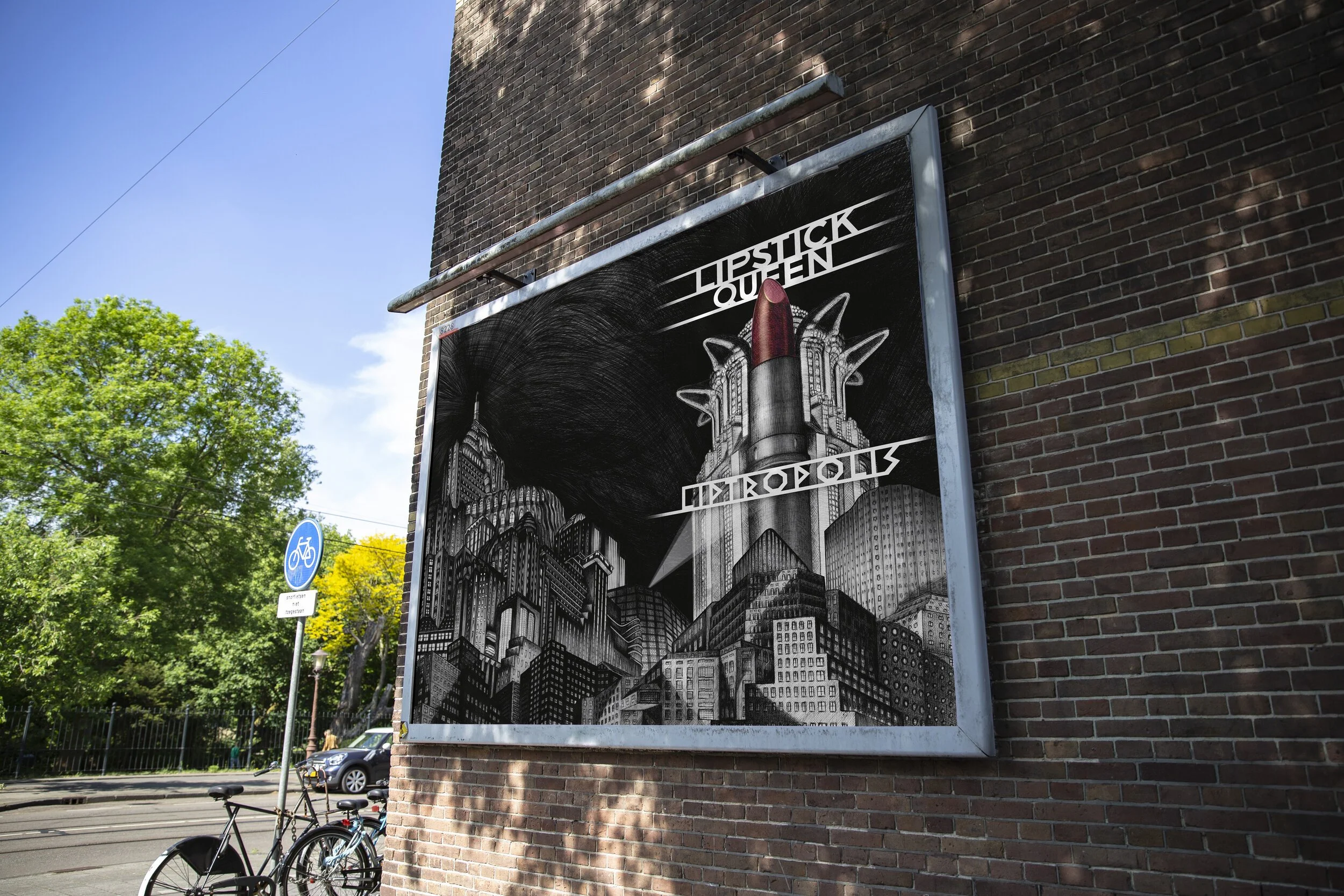
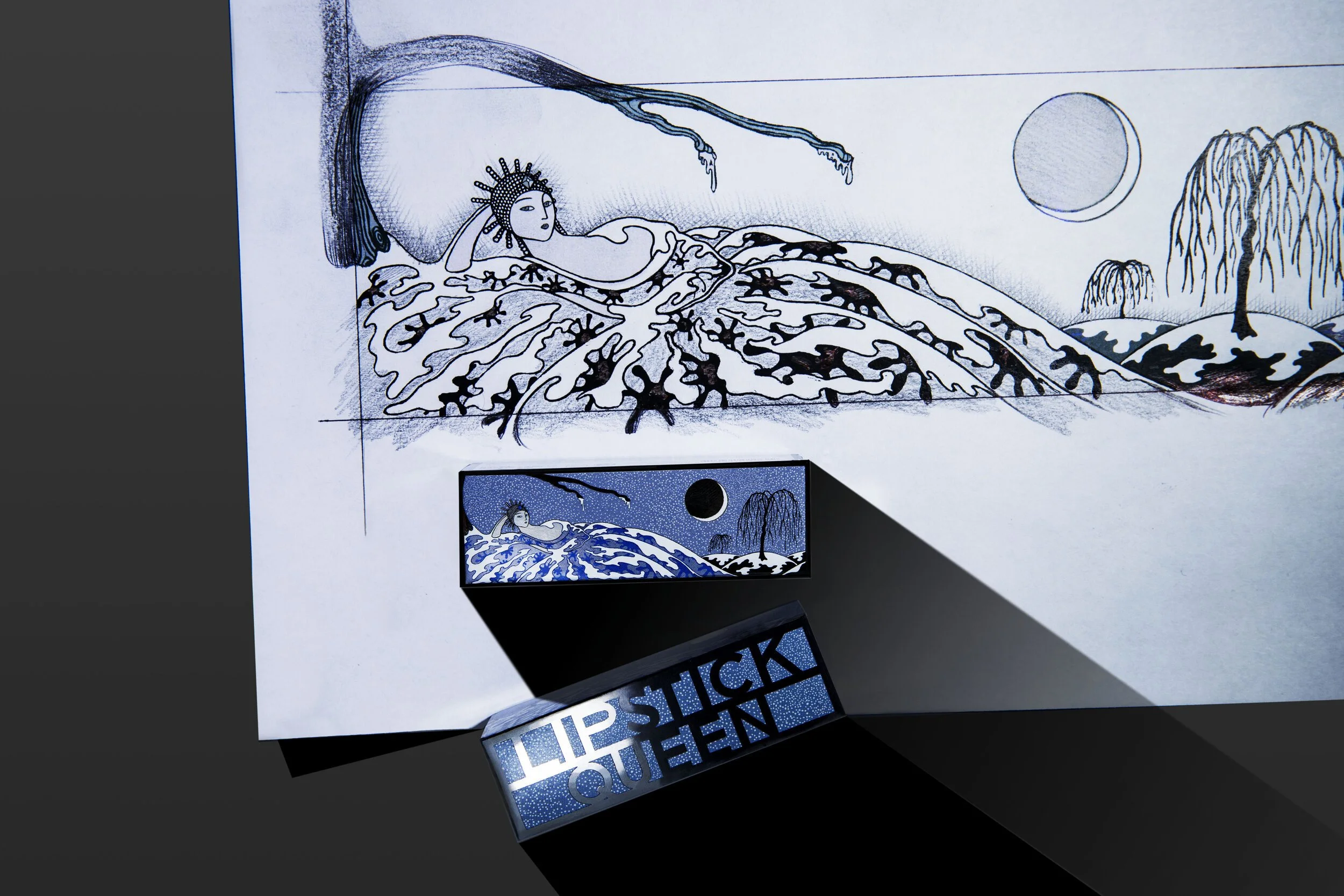
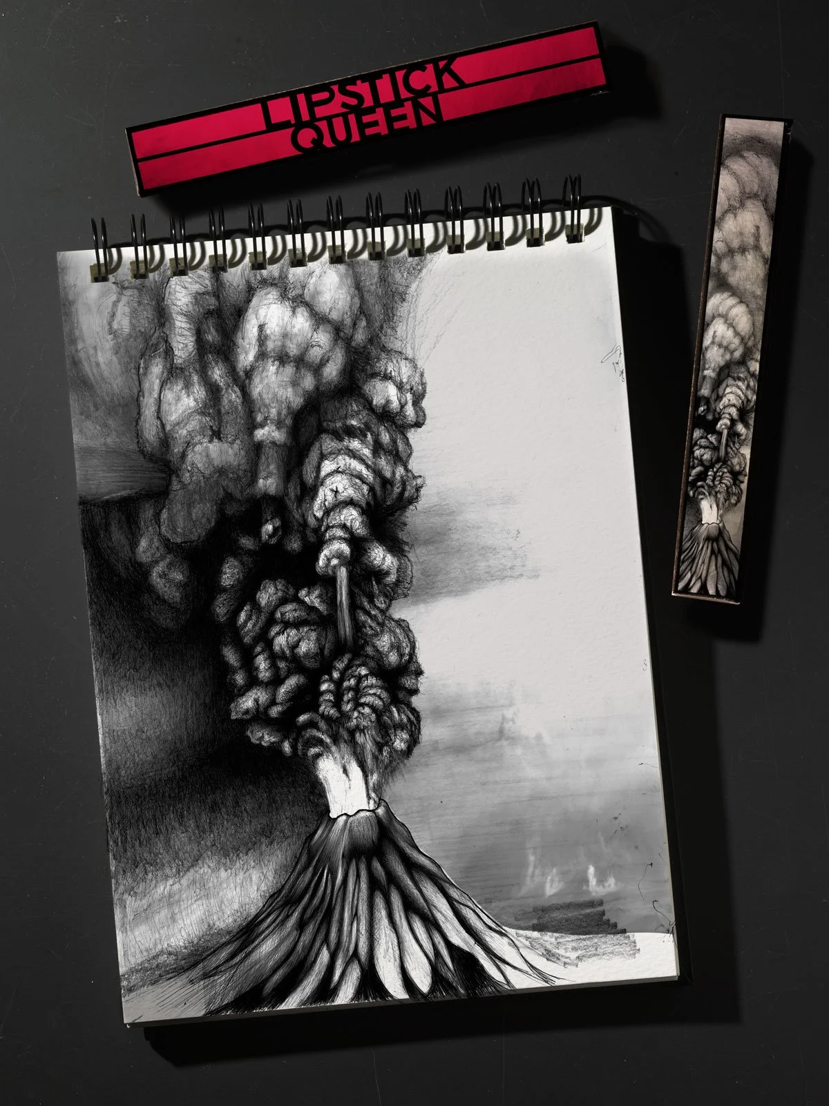
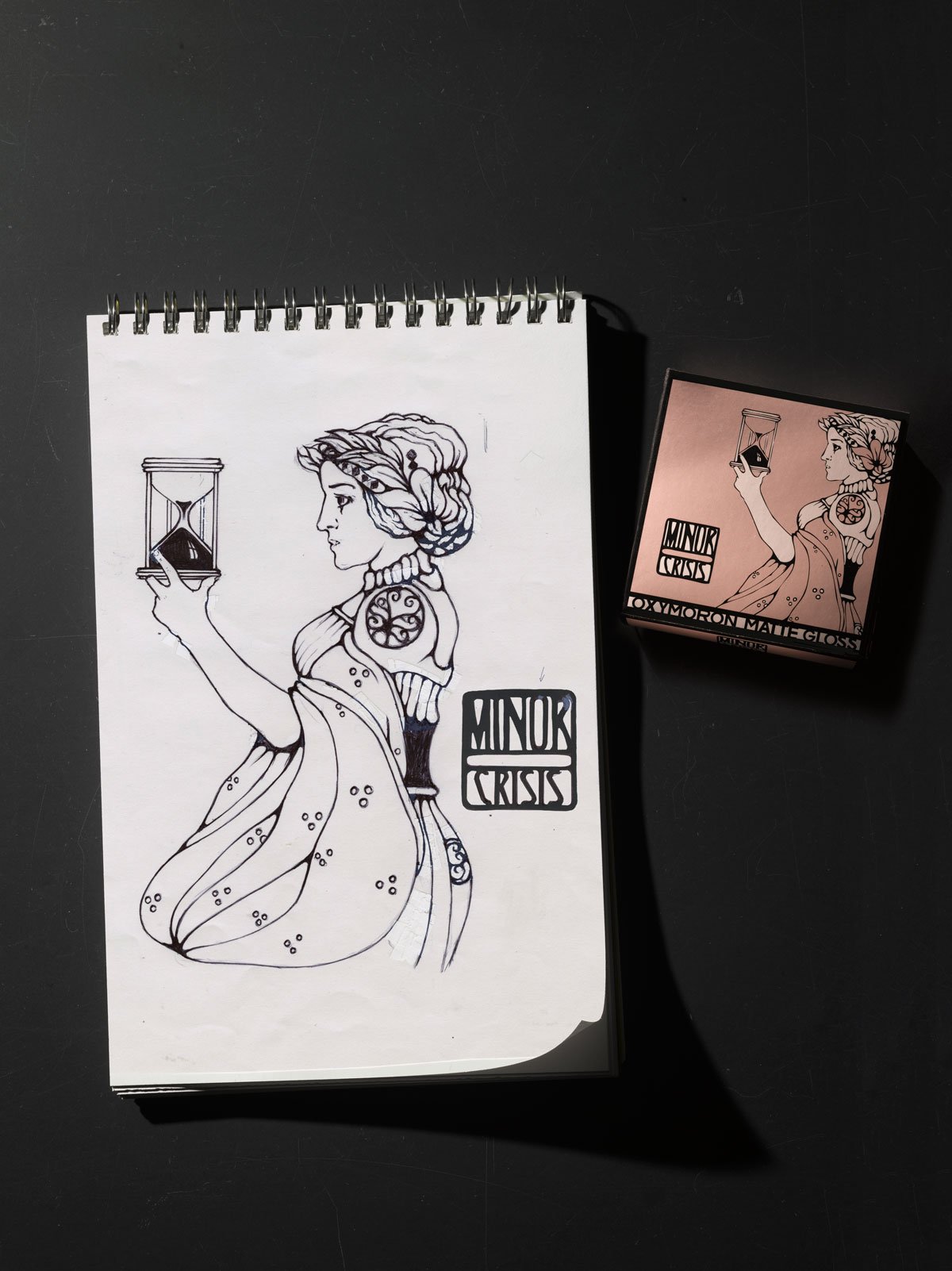
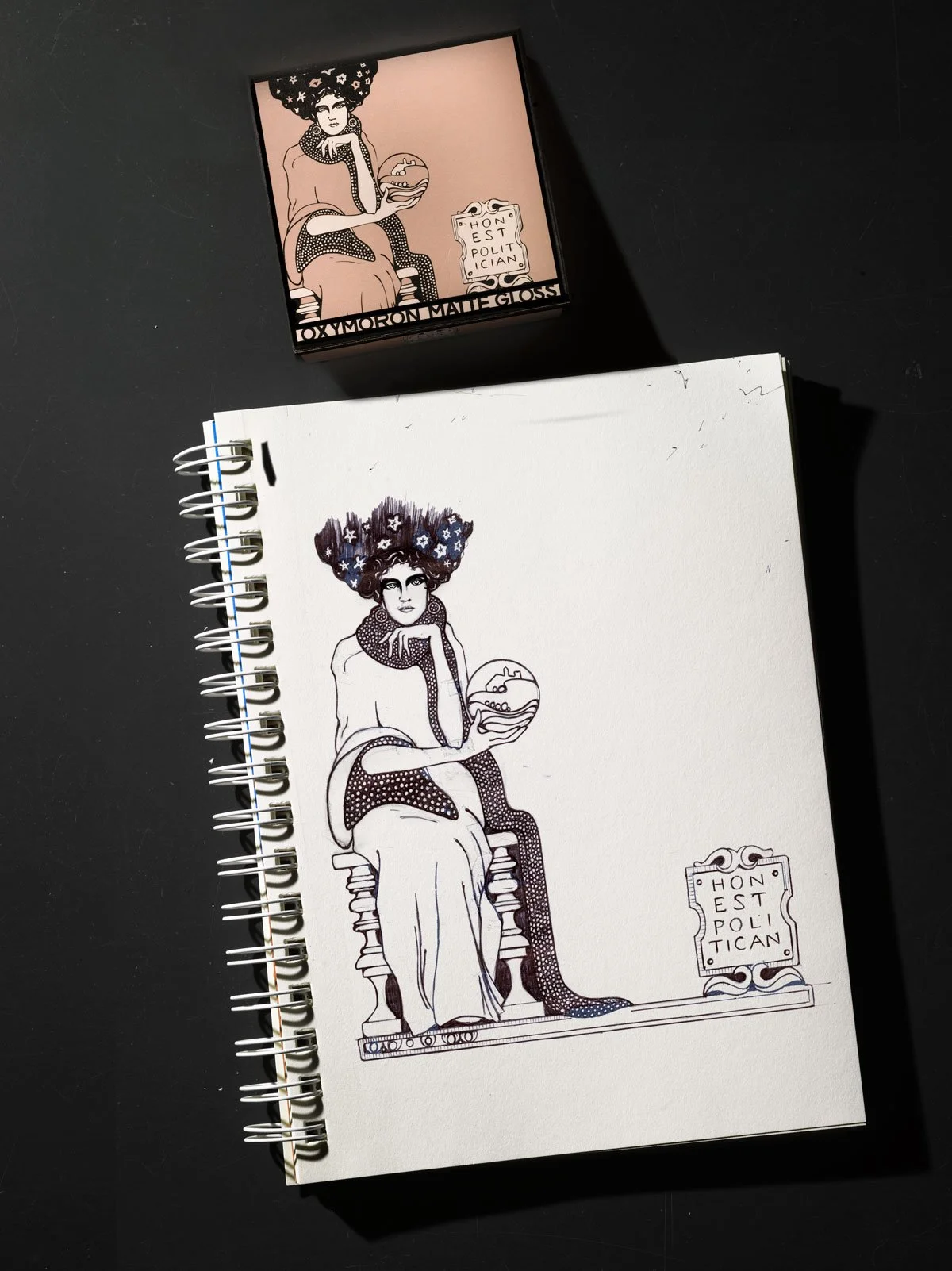
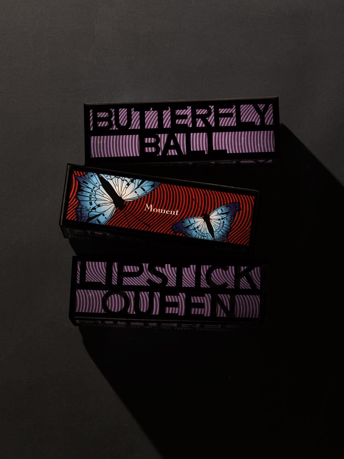
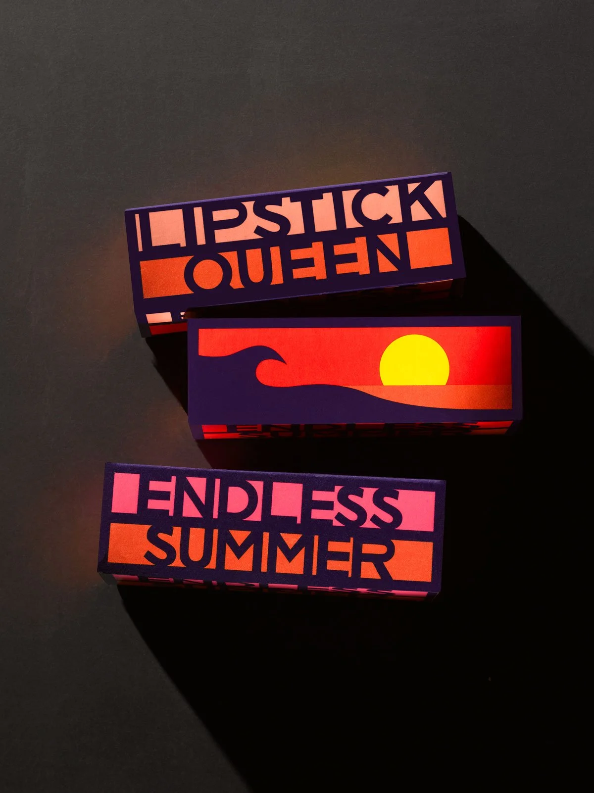
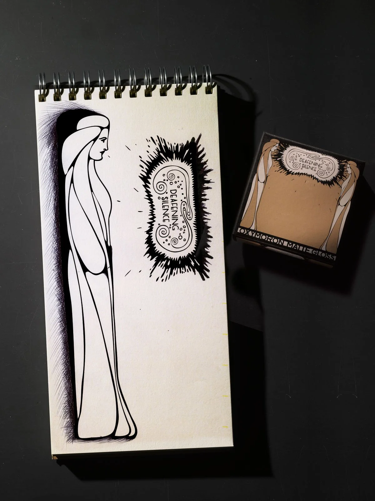
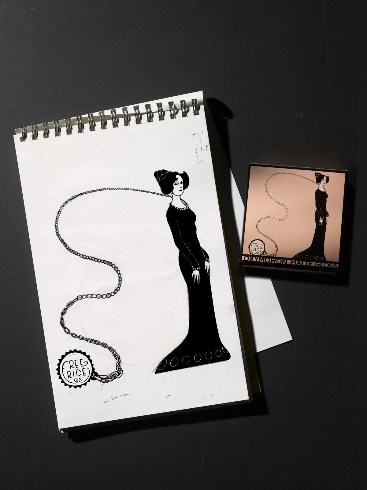
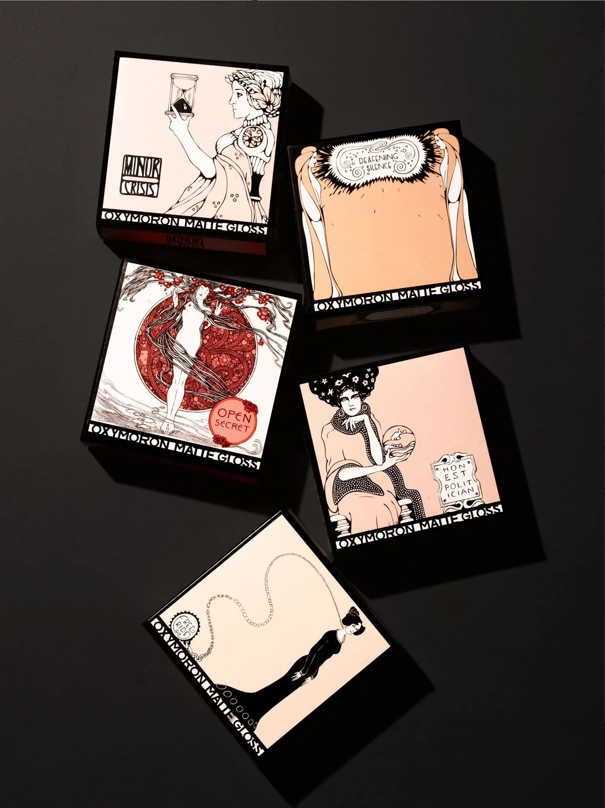
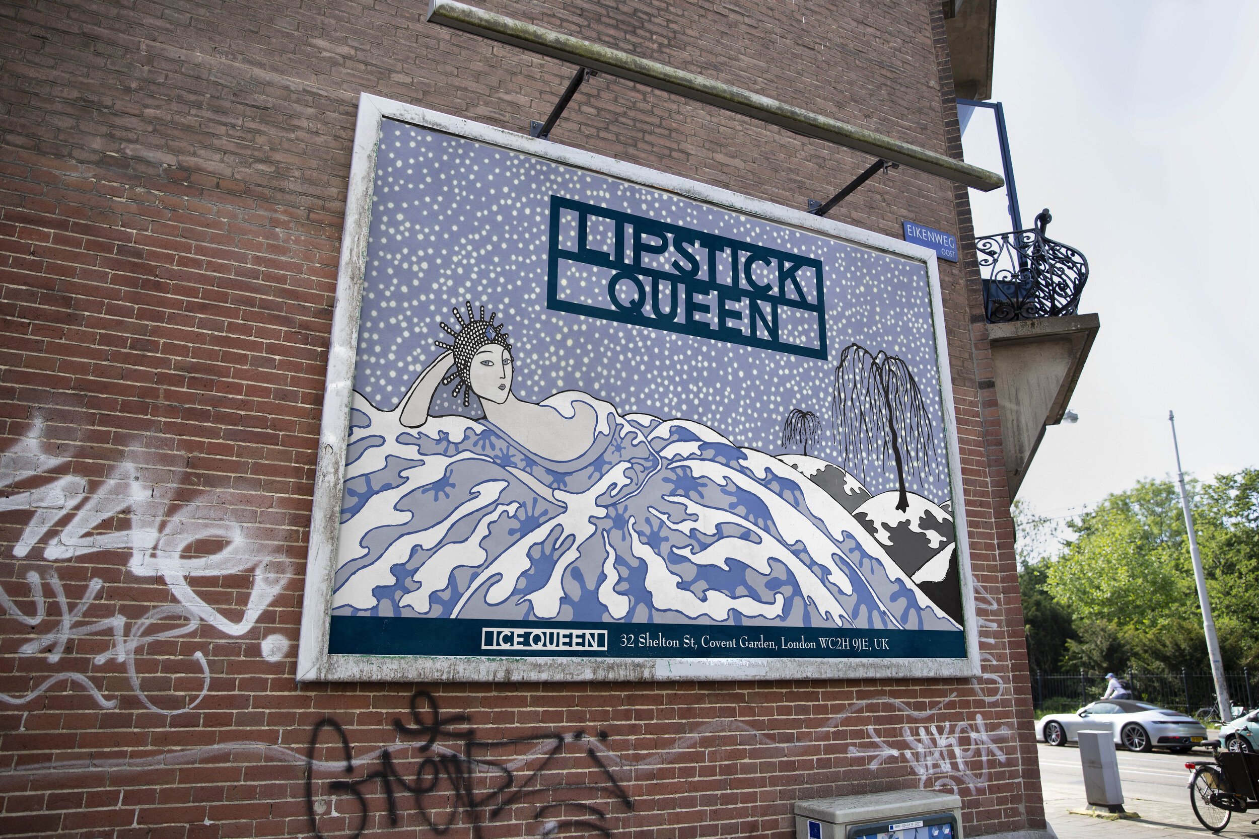
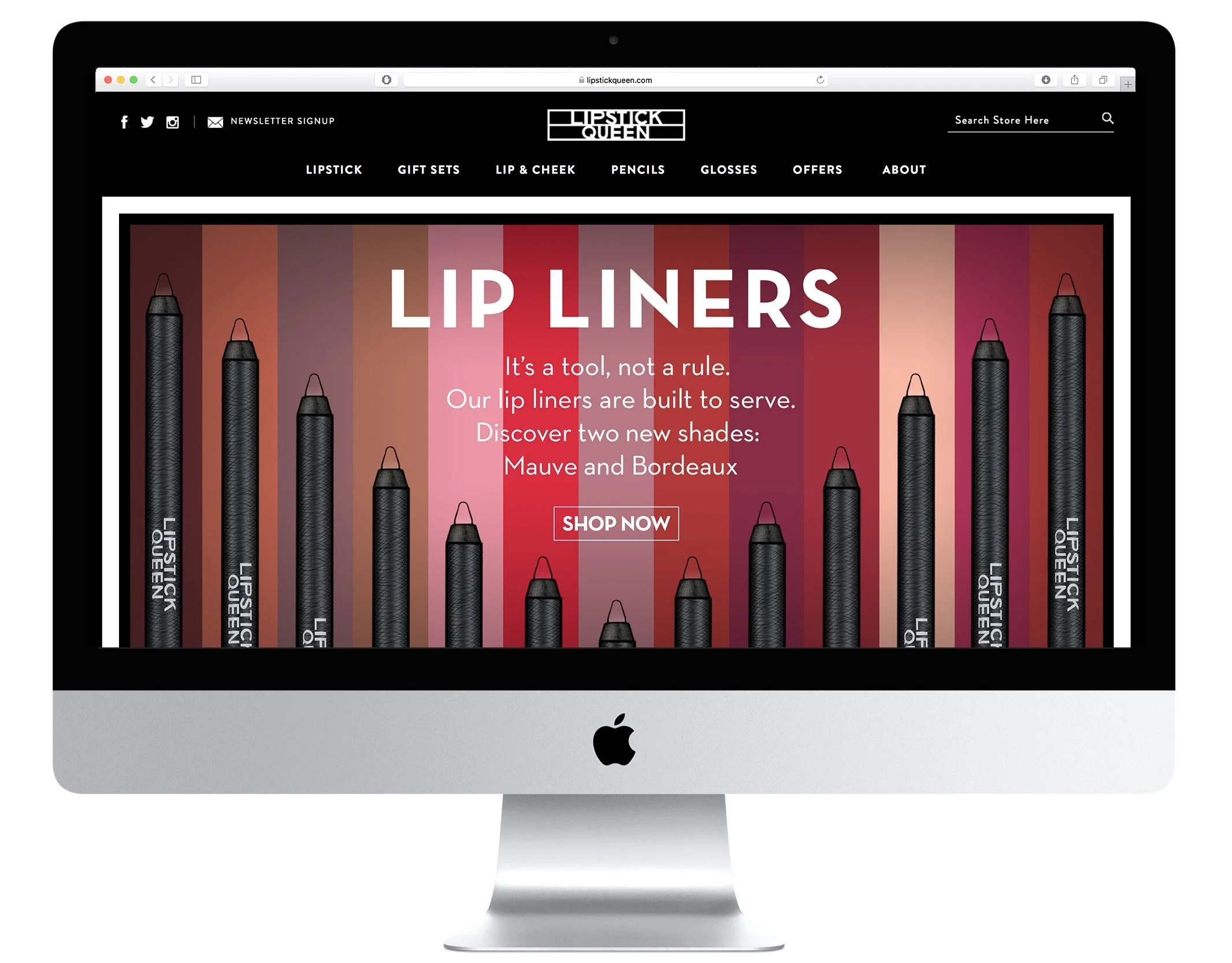
Spending no money on promotion or advertising: the only way that people learn about Lipstick Queen products is by discovering the packaging at retail, social media or by word of mouth from brand loyalists. While every other brand on the cosmetics floor sells the beauty of the world’s leading models and actors, we chose a more imaginative approach: hand-drawn illustrations by James Benard. An arthouse brand at heart, we’ve never shown a face in any of our packaging or point of sale materials. This brand is a celebration of inclusivity, focusing on who people are, not what they are supposed to look like.
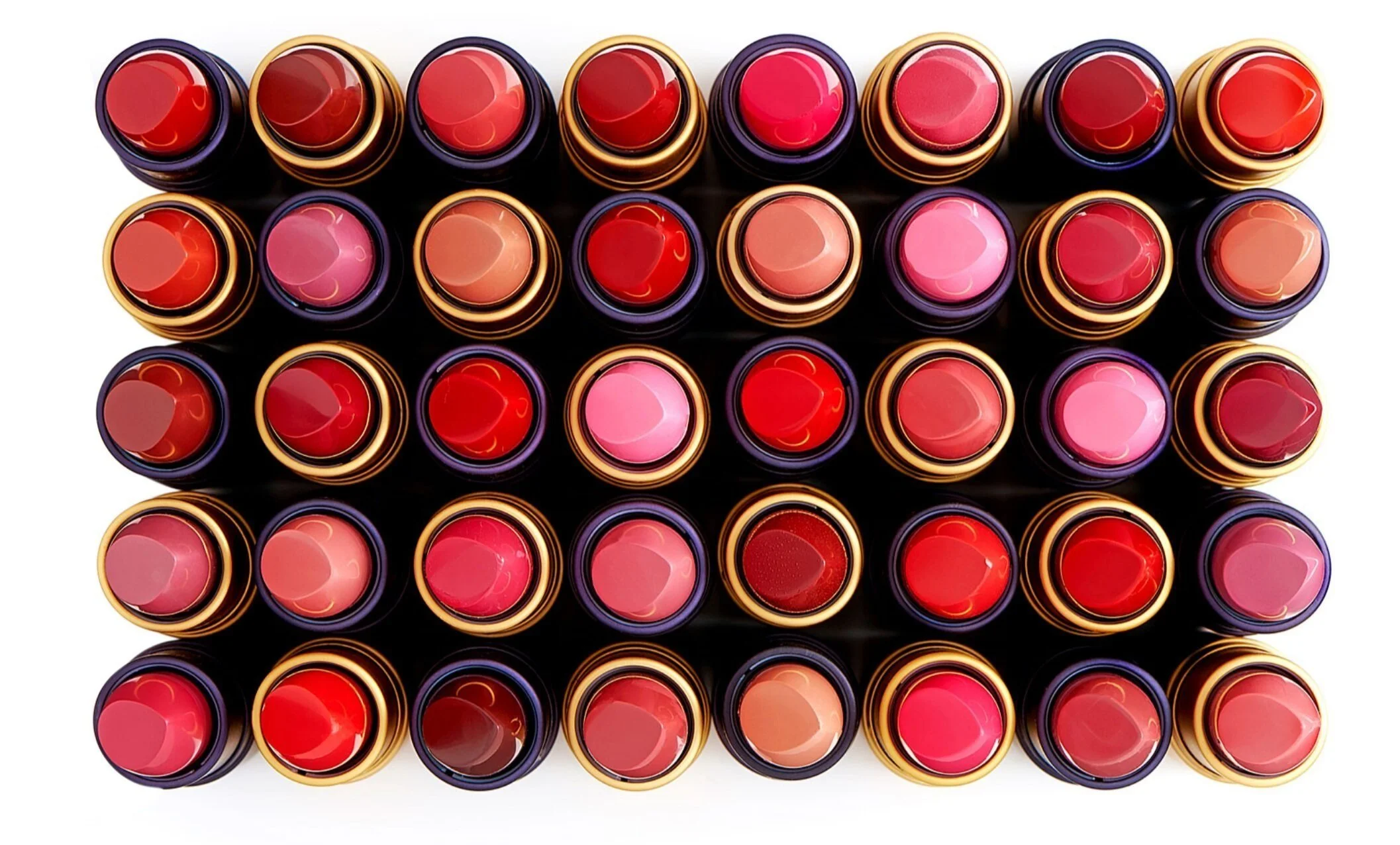
LQ’s “Frog Prince” lipstick shade, which transforms from green to pink upon application, was hailed by Elle Magazine as one of the 10 most iconic lipstick shades of all time. This brand makes a habit of constant reinvention, surprising customers. The only consistent aspect about the messaging and artwork is that it’s inventive, rebellious and unpredictable.
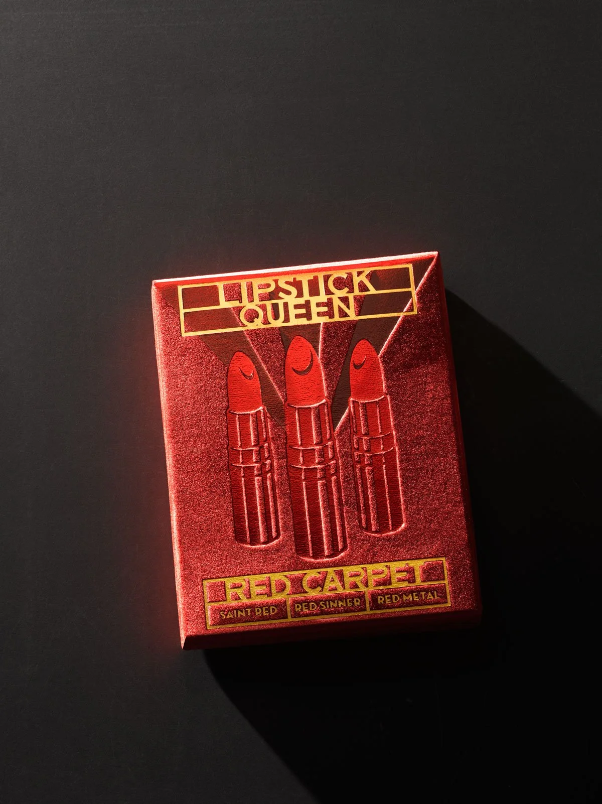
Over the years the carton visuals have become the main vehicle by which the brand speaks with consumers. Each hand-illustrated piece of art asks questions rather than offering answers. Myriad interpretations of what the packaging visuals mean have blossomed into lively online discussions, bringing new brand aficionados and long-term customers.
